Saturday 15 December 2012

Final Media Product

 The images below are the final product that I have created. In order from top to bottom they are my magazine front cover, the contents page and finally the double page spread. I created all of these using images that I personally took in a photo shoot. And edited everything else in Adobe Photoshop. The layout is something that I have gotten from looking at several different magazines from this genre, which would be the rock/metal genre.
On the left here is the music magazine front cover. This has the connotations of a real music magazine. The ways in which it does this are that the masthead is the most 'stand out' feature on the whole magazine. This attracts the audience, and previous buyers of the magazine will recognise the font and style because this would re-appear in other issues. Another feature would be the "Free Posters" part. This is a very common feature in all music magazines so this is why I have used it in mine. Another few small features that make this appear more authentic would be the issue number, magazine website, price of magazine and also the bar code. This is apparent in every music magazine, or magazine in general for that fact. This is because this is all necessary information about the magazine to make sure the customer knows how much they are paying, if they are up to date and where to find out more. Not to mention the bar code to purchase the item!


 The contents page that I have created on the left here is keeping with the main font which I used for the masthead on the front cover. I felt that even though this is now inside the magazine it still needed to keep with the house style of the magazine. The most important features about this part of the magazine is that it tells you what is where in the magazine. This is the case for all magazine, musical or non-musical. Another feature which I have found in this is that the contents page lets the audience know of other little interesting parts of the magazine which do not necessarily need a page number. This is shown at the bottom of the page. The contents page in this case does not show everything that is inside the magazine, instead it only shows the main articles, and also some smaller ones which may be of interest.


On the left here is the double page spread that I have created. The photo that I have chosen was also one that I took myself like the photo used for the front cover. The effect that I have used on the image side of the page is meant to resemble a burning look. This style is often associated with this genre, and fits nicely with the connotations of metal music. Another way in which it fits with the connotations would be the 'bio hazard' symbol in the top right corner. In this case it would be the logo for the band in which I am interviewing, but this sign is known for a danger feeling therefore choosing this for a band logo would be conforming to the stereotypes of this genre. Features which I have included which are often found in most other music magazines would be the quotation boxes in which I have entered a related quote, referring to the questions. This is designed so that they read these first and then get interested in what had been asked to provoke such a response. These quotes can often be misinterpreted as to the actual meaning because of context, but this is the reason why the reader wants to read more. The layout that I have used for this is a question and answer style. This is because it is an interview section so therefore this fits what the text is about by being properly structured.


Tuesday 8 May 2012

Forms

These are the forms which ensured safety of the photo shoot task. This is done by stating each possible risk that could happen to anyone involved, and then saying how this could have been measure to make sure it doesn't happen. As well as ensuring safety, it also condones the fact that the subject in the photo is allowed to be photographed, and also that I am allowed to use the Photo's that I have taken for the final product which I am creating.


Friday 27 April 2012

Photoshop Practice Example


This is an example of what I can do on Photoshop. These photo's above show me using some of the given tools to make the van in the top picture disappear. This is done by selecting the part of the picture you would like to copy over to another part and then it will appear in both parts. I did this with the grass and the bush behind the van to cover up the van. This is a good technique to learn in photo shop because you can fix parts of the picture that are seen as imperfections.

Friday 9 March 2012

Front Cover

This is the point that I am up to in my front cover task. This is without many effects and little editing added to it.

Thursday 1 March 2012

MoodBoard


This is my moodboard. This represents how my magazine will turn out. I have used fonts, pictures and colours that I would ideally like to use in my real magazine. Both the 'metal hammer' and the 'kerrang!' use large fonts with capital letters to emphasize what style of magazine it is. Although most of the magazines use big bold fonts, there are also fonts where is it less 'in your face' for examples the font they use for Deftones.

Friday 24 February 2012

Genre

For my real magazine, I have decided to do my magazine on heavy metal and rock music. I have chosen this because I have a interest in this style of music.
The genre of heavy metal and rock music is produced by bands with the traditional band setup. Heavy metal often is associated with thick deep sounds made with distorted guitars. This is generally what heavy metal music is most renowned for. The fact that this type of music is seen as dark, thick and heavy it means that I can incorporate it into my magazine. 

Tuesday 21 February 2012

Related Magazine Analysis


In this magazine, they use a very in your face technique to draw in the audiences attention and get them to start reading their magazine. The things that are put in this to achieve their goals are the large titles and also the colours that are used.
Firstly, the titles they use are in a bold font to stand out from the rest of the magazine to show off staright away what the magazine will be featuring. This means that where it says 'Beats' and 'Bass' you would asume that the conitations of this would be that of a electronic music magazine, because these are words that are associated with that genre. Another thing about the titles is that they are of a completely different colour to the background and there is no similarity between them. This makes it alot easier to read from a distance which means they have a better chance of attracting an audience.
Secondly in this front cover, i would like to point out the simplicity of this cover. Usually there seems to be a lot going on, on front covers because they are trying as many ways as they can to get your attention. But sometimes in this case simplicity can be the main aspect of a front over and can work even better. This is because if there is too many things going on, it can draw the readers attention away from certain parts of the front cover, parts that you may want them to see. Therefore staying simple can be a postive thing.
 
Here on the left is another example of a magazine similar to the type i am creating. Aswell as it being a music magazine, it also has a similar style of music to the 'rock' genre. The first technique that I would like to point out would be the fact that the main image of the featured band 'Avenged Sevenfold' has been placed over the main title 'Kerrang'.
Some other features about the front cover of this magazine would be the fact that although the main focus is on the featured band, there is still alternate information about what is expected to be found inside the magazine. This information would be shown in the pugs and puffs, and also in taglines which can be found at the top and bottom of the front cover.
 
This magazine which also has a simliar genre to the previous one, shares some of its features which make the magazine work well in this genre. For example again they use the overlapping image and also the extra information about what will be seen inside the magainze. 


Wednesday 8 February 2012

Preliminary Task


This is the point that i am up to in my preliminary task on the 10/2/2012. Saying this, the one on the left is the layout i feel most happy with in terms the final outcome. The picture on the right is the flat plan of my front page. This is simply what the rough layout of the front cover would be for a school front cover.

Friday 3 February 2012

Newspaper Analysis

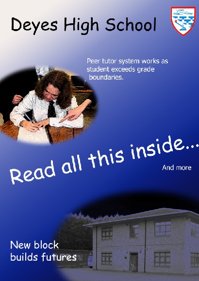
Uses colours corresponding to the logo of the school. This makes for a suitable house style for the newsletter.
They also include pictures to do with the school. This will more than likely aim to show the school in a positive light for people who don’t get to see what its like. Although in this picture they are not showing an activity happening within the school, they are showing some sort of achievment made by the school which they would like people outside of the school to know about.
The language used in this is a very formal register because of the audience it is aimed at. They use a formal language style because they do not know the audience personally, and also it is a school so seeming intelligent and knowledgable on the subjects they are talking about.
 The layout of this is mainly text because it is aimed to inform the reader. But as the text is reffering to a picture so the use of graphology is important in this piece of text. 

Wednesday 1 February 2012

Moral Panic

'Moral Panic' is when the media will display something controversial in order to change rules or to just outline problems with the world. It is acknowledged that adults will see the side of it where they would want the rules to be changed so that it wouldn't happen again. Whereas teenagers would see a controversial storyline as a interesting article.

These are examples of a moral panic because they were both shown  in the media as disturbing games that would corrupt their audience. Both Manhunt and GTA have been made out to be a negative influence on the younger people of today and gets blamed for crimes within the game happening in real life. They would blame these real crimes on the game because it is seen as a bad influence.

both 'Manhunt' and 'Grand Theft Auto' have been in the media, being displayed as things that should not be in our society. By putting these in the media and making them seem as bad they can, they are able to either make the companies change the games content or completely ban the game.


In a magazine aimed at teenagers, articles using a Moral Panic would attract the younger audience. I say this because teenagers are generally stereotyped as people who 'like what they shouldn't' so putting stories or articles about things the society frowns upon will most likely interest the teenage reader.

Friday 27 January 2012

Ideology

Ideology means the ideas behind a media text or what the text is representing. Ideology is important in a magazine because it gives a pragmatic approach to that magazine. For example, the film 'Dances with Wolves' shows a representation of the ideology of the native american people.

In a school newspaper they would use ideology do show their school in a positive light, for example they would use vibrant colours and show pictues of events that they deem to be benefitial for outsiders of the school to know they do those activities. In this case they might show a image of musical concerts to show off their different activities.

Thursday 26 January 2012

School Newsletter Task

 Front Cover

On the front page of our school newsletter, they use a lot of things associated with the school. For example they have used:

  • Pictures 
  • Logo
  • Colours
Also on this they do not include any information due to the fact that it would be spoken about inside the newsletter.

Double Page Spread

The double page spread is the place where they can share information or inform the reader on upcoming events and things of that sort. They use a formal language style because the person who wrote this it not of a close relationship with the reader, therefore informal language would be inappropriate. Also they have used similar colours to the colours that represent the school, this is also shown on the front cover with the use of the colours Blue, Red and White. In the case of the double page, they only use White and Blue, but still sticking to the general house style of the school. 
Here I have done a mock up of a NME front cover. The image below the real front cover shows the rough style in which NME have used when creating their front cover. This style is used a lot in music magazines. The features in this which I have seen a lot of would be the overlapping image which goes over the title just a little bit, and also the name of the band being a main part of the front cover. This is because the magazine is a special edition featuring a currently successful band so therefore putting their name on it would hopefully attract an audience, in this case, the people who are fans of 'Them Crooked Vultures'. 
 When making my magazine front cover, it is likely that I will use some of these features because they are used so much by a range of different magazines, the techniques they use obviously work and is what makes the magazine look so professional. 

Wednesday 25 January 2012

Rule of Thirds Example

These are my examples of the Rule of Thirds Technique


Rule of Thirds

The rule of thirds when it comes to photography it when the frame is split into 3 horizontal and 3 vertical equal segments. You would initially put the object you are taking the picture of, not in the center segment. These pictures next to this are examples of a good use of the segments (on the right) and a poor use of segments (on the left). 

Tuesday 24 January 2012

Male Gaze Theory

Male Gaze Theory 
Sucker Punch Poster


Sucker Punch: 
This film could be seen as part of the 'Male Gaze Theory' due to its deliberate all female blonde cast, Therefore the audience of heterosexual males not being the objects. 


Mission: Impossible - Ghost Protocol Poster 


Mission Impossible:
The Film Mission Impossible has somewhat used the 'Male Gaze Theory' because it does have a women object, but is not necessarily a main character they could be used to make the 'gaze'


Horrible Bosses Poster


Horrible Bosses: 
Horrible Bosses uses somewhat of the male gaze theory when it comes to one of the main character's being a female, but has a lot more of a male cast. 


Transformers Poster


Transformers:
Transformers uses a woman as an object and is particularly used for the reason of the 'gaze', the fact that the women is seen as eye candy is very important to the character. 


Underworld: Awakening Poster


Underworld:
In underworld you can see from this that the women is the main character in the film but whether or not they have used this to conspire with the 'Male Gaze Theory' is more than likely untrue. 


Thursday 19 January 2012

Semiotics

Semiotics is the study of signs. A sign in terms of semiotics is something that stands for something else (an object).

The picture on the right is how the theorist Charles Sanders Pierce thought the process of signs worked. Pierce also thought that there were many different types of sign, these would include

Index's are directly connected to the object it is signifying, Icons resemble the thing signified in some relevance, and symbols signify something it has no logical relation to.

Another theorist in semiotics would be Ferdinand de Saussure. Saussure believed that signs are purely psychological and that "a sign refers to something it is not"

Saussure came up with a theory like Piece did, his theory was that a sign is made up of two things, the signified (which is the actual object) and the signifier (which is what it means) together these would apparently make up what a sign is.

Questionnaire

I have made a short questionnaire for people to take part in to help get the best features and aspects about my magazine. To participate in this, please follow this link Here.

Wednesday 18 January 2012

Data Methods

When you collect data, you will use two methods of collecting it. The first method would be Qualitative data, and the other is Quantitative data.

Qualitative data is when you ask questions that require more of an elaborate answer to what was asked. Getting this type of data is hard to generalise but can give a more honest and informative answer.

Qualitative data is used for a more opinion based answer, or something that is specific to that  person.

Quantitative data is when you ask questions that only require a one word answer or a option to tick a given answer in a box. The advantages of this would be that it is easier to generalise and it is usually quick. Although this is more efficient, the answers may not be accurate to the actual opinion of the audience.

Quantitative data is more of a fact based answer in which there are minimal answers available.

Tuesday 17 January 2012

Introduction Post

Hello, my name is Andy Nelson and have taken Media Studies at A level. In this blog I will be posting my work for each stage of completion.

My preliminary task is to produce;
-Front Page
-Contents Page
For a school magazine.

My main task is to produce a music magazine, for the younger generation, which will talk about a local band which I have access to. I must provide a
-Front Cover
-Contents Page
-Double Page Spread

All of this work will produced by me including all pictures and text.